Recently you may have seen our white paper on designing the optimal website. In that study, Nutmeg was the first of the sites we used as an example. We used it twice in fact – first for its successful clarification of its aim, and then for it’s understanding of the target audience. But we appreciate Nutmeg’s work so much that we could dedicate an entire post just to their site – so that’s what we’ve done.
Incase you haven’t seen the white paper (you really should have a read!) we’ll summarise the main points as that’s the path we’ll tread below. We focused on five primary steps to achieving a beautiful and lead-converting site: Clarify Your Aim, Understand Your Audience, Research Your Competitors, Make It Mobile, and Call To Actions.
Nutmeg successfully combines all of these with a website that provides the information that you need, in a way that you want, and adds e-commerce tricks to boot. They’ve got a guy from Google behind them for this side of things, which is a huge bonus, as well as an old hand at investments for the financial intricacies.
First an introduction: Nutmeg is a financial investment management platform that allows users to invest via template portfolios that meet their risk-approach. That’s a quick insight, and for now will do. On to the good stuff!
1. Clarify Your Aim
As a sneak peek for you in to our Web Design white paper, we’ll use the same commentary for these first two steps. Nutmeg kicked off in mid-2012 and has enjoyed brilliant success on the back of its casual but confident service. After a few years of fallout from the GFC, and as more and more banks became culpable in the cleanup, Nutmeg filled a gap in the service of investment management. They made it accessible for investors of most stature, taking the initiative away from big banks that people had lost faith in.
They knew that they weren’t trying to compete with a Barclays, or even a smaller Investment Management firm – they were going for a whole new form of financial investment, and that meant a new approach to how online investment worked.
2. Understand Your Audience
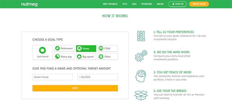
To appeal to the audience they clarified through their aim – people who didn’t necessarily have finance experience or had lost faith in big banks – they had to create a site that was approachable and moved away from a typical ‘charts and numbers’ finance site. That would just scare leads off.
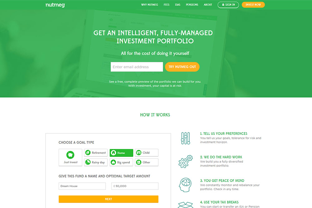
They dealt with this through light, airy colours of white and green and used cartoon icons to deliver often-complicated messages. They left plenty of space between each of their home-page sections, and did everything they could to avoid any resemblance of complication.
Nutmeg successfully appealed to an audience they had researched before launching, and proof of this success is being seen in their continued growth.
3. Research Your Competitors
The beautiful world of finance requires (as a nice term) firms to refrain from criticising the industry – that includes competing firms. So companies are fairly hand-tied in what they can say about their offerings compared to others, and Nutmeg certainly abides by this as a whole. However, they’re also very clever in that their website provides clear insight into a ‘different’ approach to investment than we’ve perhaps seen before.
An obvious step away from competition is the light, airy feel they’ve lent the site, with icons and text that gives an animated, almost cartoon-style feel. This is designed specifically to distance themselves from the industry that, as we spoke about above, had come into disrepute.
Nutmeg understood that if they were to be a step apart, and attract a different audience, they would need to make their site simple, informative and without the industry jargon the other sites had. They achieved this in spades.
4. Make It Mobile

As I’m sure we all know, responsive websites are an absolute must in today’s world, not only for looks and feel and lead-conversion, but for the ever-critical search engine optimisation points it achieves.
Google has made it very clear to us all that if your site doesn’t suit the user’s needs, it won’t rank on mobile SERPs.
Nutmeg not only does the obvious task of collapsing the site into a mobile view – they also cleverly change sections to make CTAs easy to use and to encourage people to go to the desktop site for more information.
Which leads us on to our fifth and final point.
5. Call to Action (CTA)

In our white paper we write that at the end of the day, business websites exist to increase user engagement, conversion, loyalty, or another synonym for modern business.
CTAs are quite often being found to be the make-or-break of this list.
Nutmeg is clever in its use of a call to action. They can’t make use of the full-screen landing page version because their user’s won’t receive any information from a first point-of-call. Their site is designed to make investment simple and easy to understand – hiding information behind a barrier doesn’t achieve this.
Instead, they go for an attractive, top of screen CTA using light, brand colours with a standout, highlighted box (orange on green) that has been proven to dramatically increase clicks.
Their statement is clear, ‘Get an intelligent, full-managed investment portfolio’, and from the outset the user knows what to expect.
Nutmeg is a website designed to please, both informatively and aesthetically, and all of us can take a leaf out of their book when designing our own websites!