We all know website design is important. Getting your website right – the feel, the effect, the performance – is a critical part of running a successful business both online and on the street. But with all the changes that are constantly occurring, its hard to keep up to date with what works, what doesn’t, and what the current best practices are.
Well, worry no more! We’ve put together a guide to help you through the maze that is website design, with tips that will get you through most of the niggly upheavals the industry sees over a short span of time.
In our guide we cover five key areas to focus on. A process if you will, of steps to take to ensure your website delivers what you need to increase leads, increase conversions and build a loyal customer base. We use real world examples of companies that do it right and discuss how they’re succeeding.
Wolf – An Introduction
Hello and welcome to Wolf’s ‘How To Design a Website’. We can’t wait to get stuck in to the nitty gritty with you about the importance of website design and how to go about it, but first – who are we?
Wolf is a web design, SEO & digital marketing agency based in Sussex, East Sussex. We look after businesses both big and small with all their online needs, be that website development, graphic design, content production, social media marketing, traditional SEO Services, or an overarching marketing strategy. We also specialise in branding and logo design, and enjoy working with clients from start to finish. We really are a one-stop agency.
We’ve been doing this a long time, and absolutely love the fast-paced nature of the industry. We have a loyal base of clients that keep coming back, and building relationships is something we pride ourselves on. We work with start-ups as well as established companies, from choosing a company name to registering as limited, dealing with trademarks and domain names, and all that (not so) fun stuff that people sometimes forget about in their excitement. So, with that all said, let’s get you up to speed on why designing a good website is important, and some step-by-step tips on how to do it.
Content
What We Cover
Why Good Website Design Is Important
5 Steps To Designing Your Website
Step 1: Clarify Your Aim
Step 2: Understand Your Audience
Step 3: Research Your Competitors
Step 4: Make It Mobile
Step 5: Call To Actions
Summary
How To Get In Touch
Sources
Why Good Website Design is Important
Why is good website design important? What a question! In today’s digital age, this world of the Internet of Things that we have created, a business’s website and a corresponding online presence is so often the make-or-break factor.
So much goes into an online presence, and with the world becoming more and more mobile-reliant, there is a certain argument that Mobile Application technology is where the future lies. Interestingly though, that is about as true (for now) as the myth a decade ago that the print news industry was about to go bust!
Don’t get us wrong, mobile is critical – but in responsive sites at least as much as apps. We’ll look at that in more depth further on in this paper. First, however, it must be noted that website design is perhaps more important than ever before, and with competitors at every turn it is no longer an element of your business that you can afford to overlook.
Good website design involves more than just appearance. Design includes in-depth thinking around details like load time, audience trust and loyalty, and information processing. It hardly needs to be said that this all has a critical impact on your Search Engine Optimisation (SEO) work. Adding to all these online intricacies is the fact that, offline, people will judge you on your digital presence.
How many times have you searched for a local business, only to be swayed by their website? Usually, the existence of a site – especially a good one – will be the difference between two companies.
But as we mentioned earlier, more technical aspects of design than the look of the site do come into play, and have a big effect on a number of important stats like search engine rankings, lead conversion, and overall site performance.
Take SEO and Conversions to start with: 40% of visitors to a site leave if the page takes more than 3 seconds to load! This stat has been around for a while, and the acceptable load time is steadily decreasing. Faster load times have also been found to correlate with lower bounce rates. Speaking in SEO terms, this plays a big role in how Google perceives your site to perform.
An amazing statistic that impacts audience loyalty, not to mention lead conversion, is that 94% of users say the design of a website can influence whether they trust that company or not. That’s a staggering statistic that really needs to stay at the forefront of our minds when thinking about the design of our sites.
It may seem obvious, but layout is a big one that perhaps not enough website owners spend time thinking about. There is plenty of research available around how people read a website, what draws their attention the most (and, indeed, the least!), and you should keep in mind that at the end of the day, people come to your website because they want something. If this information is hard to find or not immediately available, why would they stick around? They owe you nothing. Granted, some brands base their marketing/appeal around certain feelings of quirkiness or mystery, but for the most part you should be putting information right in front of your audience’s eyes.
So, design comes down to more than colours and your logo. Lots of technical skills come into maximising results from users’ tendencies and actions, and it’s something that you can make the most of through a professional.
Following, we’ll go through 5 steps you should pass through on your way to designing the ultimate lead-converting, relationship-building website!
5 Steps to designing your website
(Clarify, Understand, Research, Make It Mobile, CTA)
To this point we’ve spoken about why websites are important, why design is important, and what sort of technical aspects of that design don’t usually come to mind in casual conversation. But how can we convert an understanding of the sort of thing we want to achieve into actionable steps to progress through?
Good news dear reader! We’ve put together the following 5 steps: Clarify Your Aim, Understand Your Audience, Research Your Competitors, Make It Mobile, and Call To Actions!
As we go through and talk about each of these steps, we’ll take a look at some websites that do well in that aspect.
Remember, website design is critical regardless of the size or purpose of your company, and this process is built to ensure you’re making the most of what can be a lengthy and scary task. So let’s crack on!
Step 1 – Clarify your aim
It’s interesting to see how many of us look at the Internet as a big scary world that has no place in how our business operates. This couldn’t be further from the truth.
Let’s say you love making food and you enjoy the odd coffee. An opportunity has come up to open your own café and, with a bit of business knowledge in your pocket, you decide to have a go. The first thing you would do is clarify with yourself what it is you’ll be doing exactly.
Sure, you’ll run a café. But what sort of café? Will you offer the best breakfast in town and have an instant coffee machine available in case someone wants one? Will you be set up in the classic chairs and tables style, or are you looking for a fresh feel? Couches and pillows sitting under stained-glass windows!
The point is, to Clarify Your Aim is not to say ‘I’m a café’ or ‘I’m a plumber’, it’s about the detail in what sort of business you are, what your selling point will be, and how this will impact your website design.
Time to look in the real world (or rather, the Internet), utilising a few different companies and looking at what their website says about their aim.
Step 1 – Example 1: Nutmeg
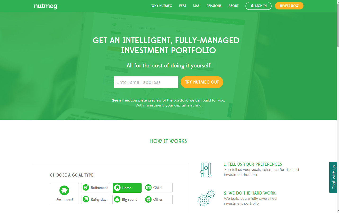
Nutmeg kicked off in mid-2012 and has enjoyed brilliant success on the back of its casual but confident service. After a few years of fallout from the Global Financial Crisis, and as more and more banks became culpable in the cleanup, Nutmeg filled a gap in the service of investment management. They made it accessible for investors of most stature, taking the initiative away from big banks that people had lost faith in.
They knew that they weren’t trying to compete with a Barclays, or even a smaller Investment Management firm – they were going for a whole new form of financial investment, and that meant a new approach to how online investment worked.
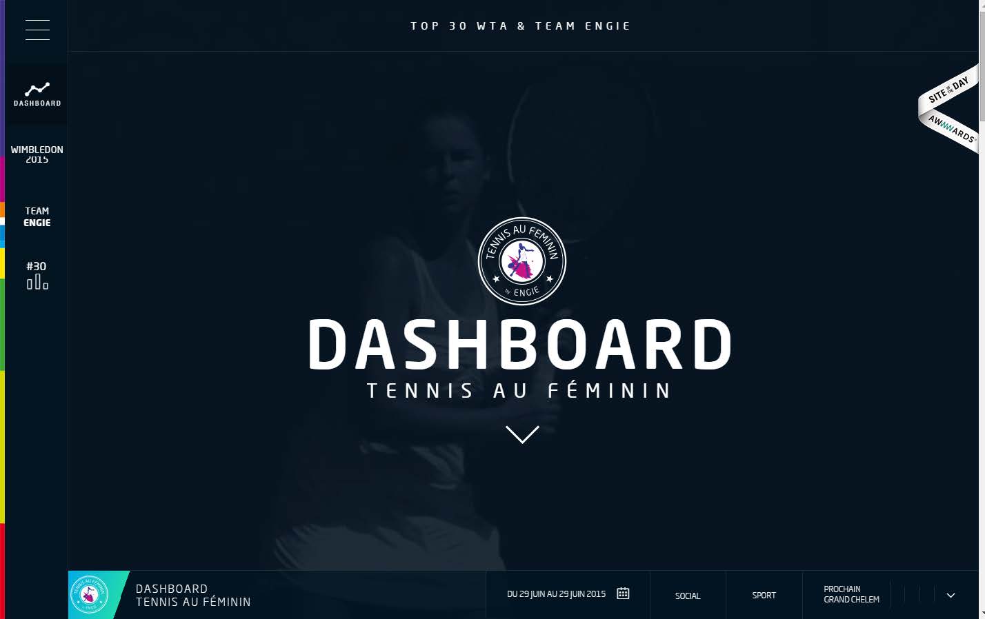
Step 1 – Example 2: ENGIE
ENGIE is a sponsor of women’s tennis, having backed a number of high-profile players for over two decades. Despite that, outside a select group, not many of us could say we know of ENGIE – a giant in French women’s tennis.
So their aim in kicking off a new website was not to add to the noise of ‘we sponsor sport’ pages. Instead, they realised that to optimise their benefits of sponsorship they needed to give tennis fans a reason to use the site.
This is a good example of why clarifying your aim leads so well into understanding your audience: ENGIE knew they wanted to attract tennis fans to broaden knowledge of their work. Their aim was more than generic flag-waving; they were targeting a fan-base.
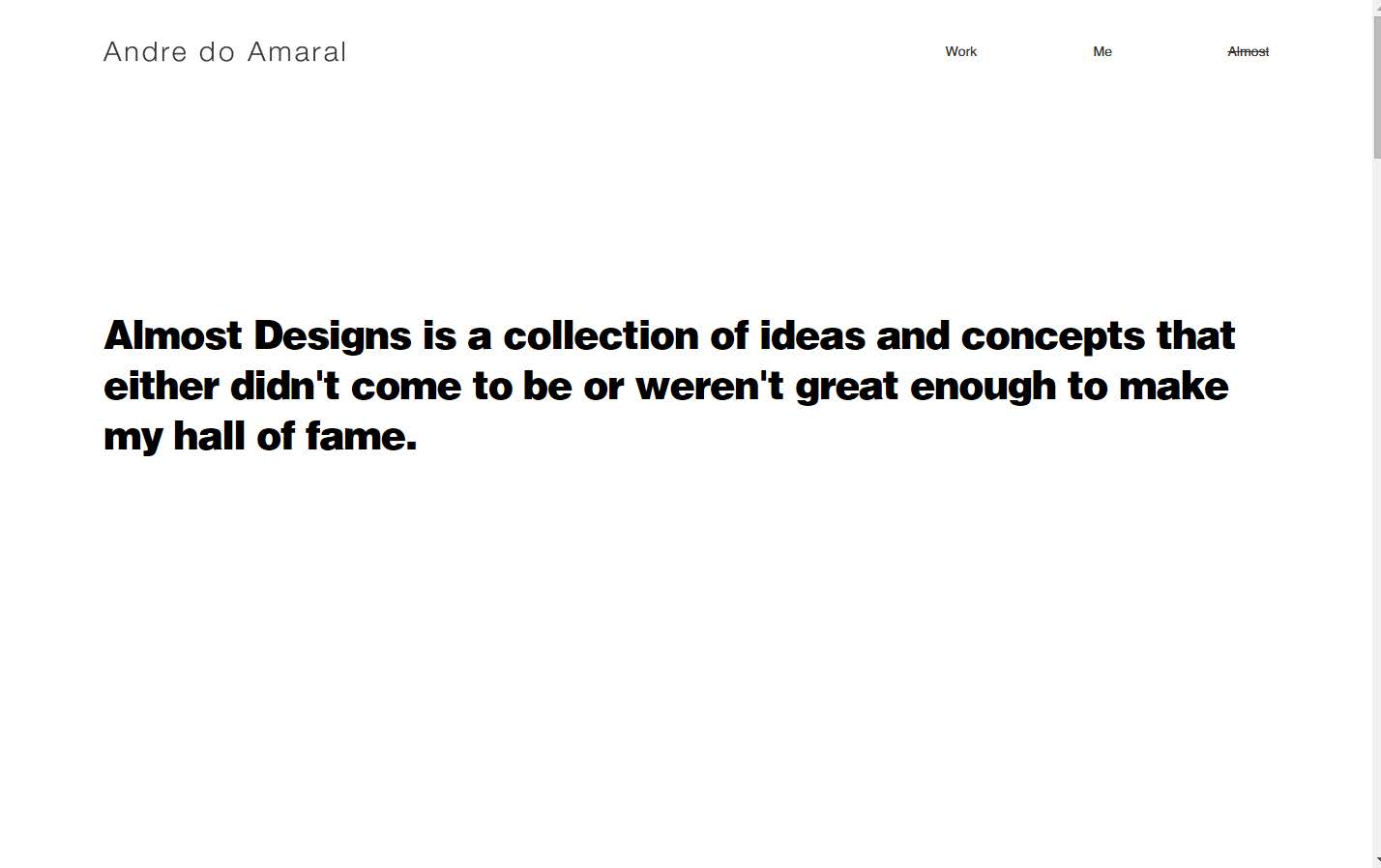
Step 1 – Example 3: Andre Do Amaral
We’re going out on a limb and using a design website for this example. So many websites in a flooded field follow generic laws of design. This one, however, has blatantly taken care to clarify an aim before kicking off.
Rather than following a proven format (which can be risky and won’t always work!) they’ve hit straight at the heart of what they do. They’ve made their work their home page, their information a large-font paragraph, and driven the site to be an exhibition rather than a sell.
This is a really good website to think on if you want to base yours off an approach of aim rather than unoriginality. Fear not difference if it plays to what you want to achieve.
Step 2 – Understand your audience
Once you know what it is you’re trying to achieve, you’ll want to work out how to achieve it. Understanding your audience now becomes your central demand.
There are many, many differences in how, when and why different people use the Internet. For example, two out of every three Millenials use two devices a day. If you’re a brand new nightclub, therefore, and you’re targeting Millenials, you can’t afford to have a site that is only useable on one device. You might like to design it in a way that can use memberships, and when a member switches from one device to another your website will know what they were looking at and open to that page.
52% of Generation Z say they study for research assignments by watching YouTube or using Social Media for information, and of the 13-17 year olds in this bracket, 25% left Facebook in 2014. Compare that to Generation X – 82% are still on Facebook. That is an incredible insight into the split directions these two target audiences, which is a pretty broad brush, are heading!
What does all this mean? A number of things. Everyone’s different and you need to know how he or she will view your site, what they will expect from it and what they will do afterwards. This really is an open point, and we could be here all night, so let’s take a look at a few examples of sites that did, or didn’t, understand their audience.
Step 2 – Example 1: Nutmeg (again)
Now, you’ll have to forgive us – we’re going to reuse an example from earlier because Nutmeg just delivers this so well. To appeal to the audience they clarified through their aim – people who didn’t necessarily have finance experience or had lost faith in big banks – they had to create a site that was approachable and moved away from a typical ‘charts and numbers’ finance site. That would just scare leads off.
They dealt with this through light, airy colours of white and green and used cartoon icons to deliver often-complicated messages. They left plenty of space between each of their homepage sections, and did everything they could to avoid any resemblance of complication.
Nutmeg successfully appealed to an audience they had researched before launching, and proof of this success is being seen in their continued growth.
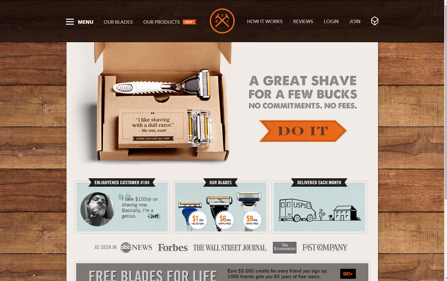
Step 2 – Example 2: Dollar Shave Club
There’s a pretty good chance you’ve heard of Dollar Shave Club. They’ve been making waves for a while now across digital, print and chins.
Their website is, along with their marketing, a perfect example of design for audience. Their website emphasizes masculinity, because that’s their target. They want men to want them, and they make no secret of the fact. They use dark, manly colours, raw humour, and content (yes, that counts as design) that appeals to the modern user: short and simple.
Their logo is not overpowering, because they assume visitors to the site are not there because of their branding (although in this case they probably are!).
Here we’re talking about website design, but it’s a great idea to take note of everything Dollar Shave Club brings out on the marketing front as well, because that may influence what aspects of your own design you might leverage.
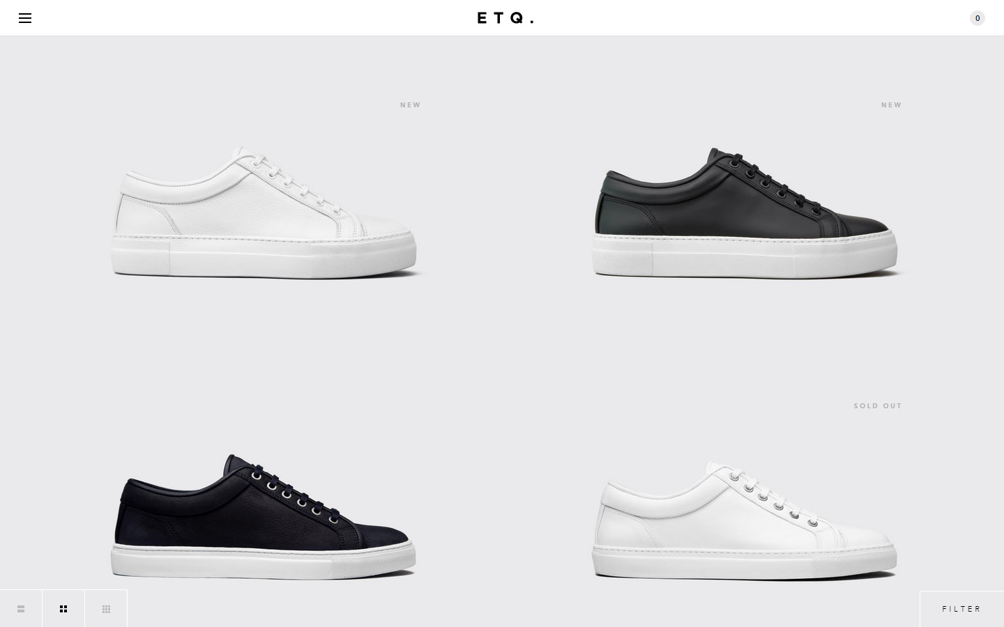
Step 2 – Example 3: ETQ
ETQ are a mid- to high-end footwear company looking to move away from heavy branding and push-marketing.
They cleverly combine an initial landing page of full-screen, non-specific photography with a subsequent home page of seamless, scrolling product imagery.
ETQ understands that the audience they attract are purely there on a fashion basis. If they want more information on the company, they can find it. But the initial part of their relationship needs to be based on showcasing their product.
Added to this is that many of their site users won’t have seen them before, so it’s important to have an obvious showing of what they can offer to draw leads in.
Step 3 – Research your competitors
It’s important when commencing any new part of your business to take a look at who is doing similar, and how they’re doing it. Not only does this build on the information you’ve gained on your audience, it also grants you insight into what approaches work, and what you could do differently.
In terms of web design, this is important in many ways. Consumers in today’s world are now expecting of nothing less than the best they’ve had. In other words, your website needs to provide at least the service/information/other that your competitors do, or you won’t build loyalty. Leads will simply leave.
Other things to bear in mind include your approach to conversions – what works, what doesn’t – and what your competitors are doing around design to boost SEO efforts – be that content placement, or funnel-marketing techniques to decrease bounce rate. Where are they placing social media links? How are they laying out their forms to increase attractiveness? What CTAs are they making the most of (we’ll talk about these further on)?
As with our other steps, there are myriad examples of the sort of things to look for. The key is to keep an open mind, look hard and long, take comparisons seriously, and where possible hire a professional – they’ve done it all before.
With that said, let’s take a look at some different websites and imagine we’re trying to enter that industry. What sort of things can we glean in just a short space of time?
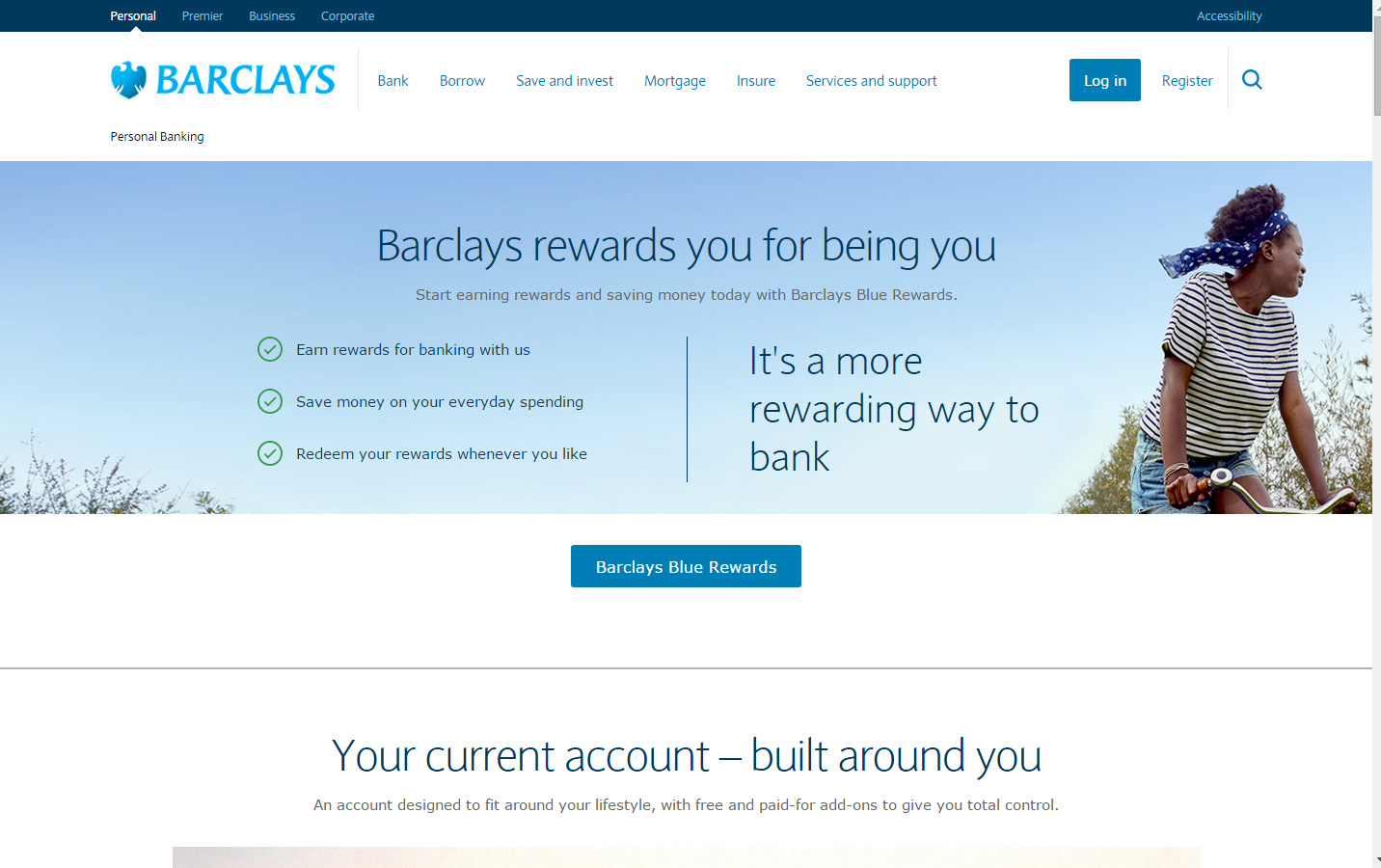
Step 3 – Example 1: Barclays Bank
For our first case, let us assume we’re a medium sized bank looking at substantial growth, and realise we need to understand what our (soon to be!) competitors are doing online. First stop: Barclays’ Bank.
There will often be the obvious first hit: brand colours. It’s important to take note of this of course, but there are far more pressing things on the agenda. At the top of the home page we can see there is a lot of information in the form of menus – the type of banking you’re performing, what you want to do within that type, as well as a common login or register option. All of these are things that can be seen on a lot of banking websites, so you note that down as something you might tinker with. Perhaps you have a simpler structure with lesser services, in which case fewer menu options is a real advantage for you.
Next, you jot down thoughts on imagery. Barclays has gone for a stock photo of a girl enjoying a ride on the bike. Any number of arguments can be made as to what the aim is, but it’s important for you to consider whether this type of image would work for your business, or if this vagueness could be used to your advantage. Potentially, one of your positives is that you represent a very bespoke type of client, in which case your visuals can target them far more specifically than the Barclays example.
Finally (in an actual case we hope you’ll come up with more than three points!) we can see how the page is divided after the banner: a section focusing on the user’s current situation, two sections looking at what the user might be after, and the rest of the page scrolling through positives about banking with Barclays.
How would this change for you? One thought could be that as you’re looking to establish yourself, your credentials and positives may go nearer the top to build trust with the user.
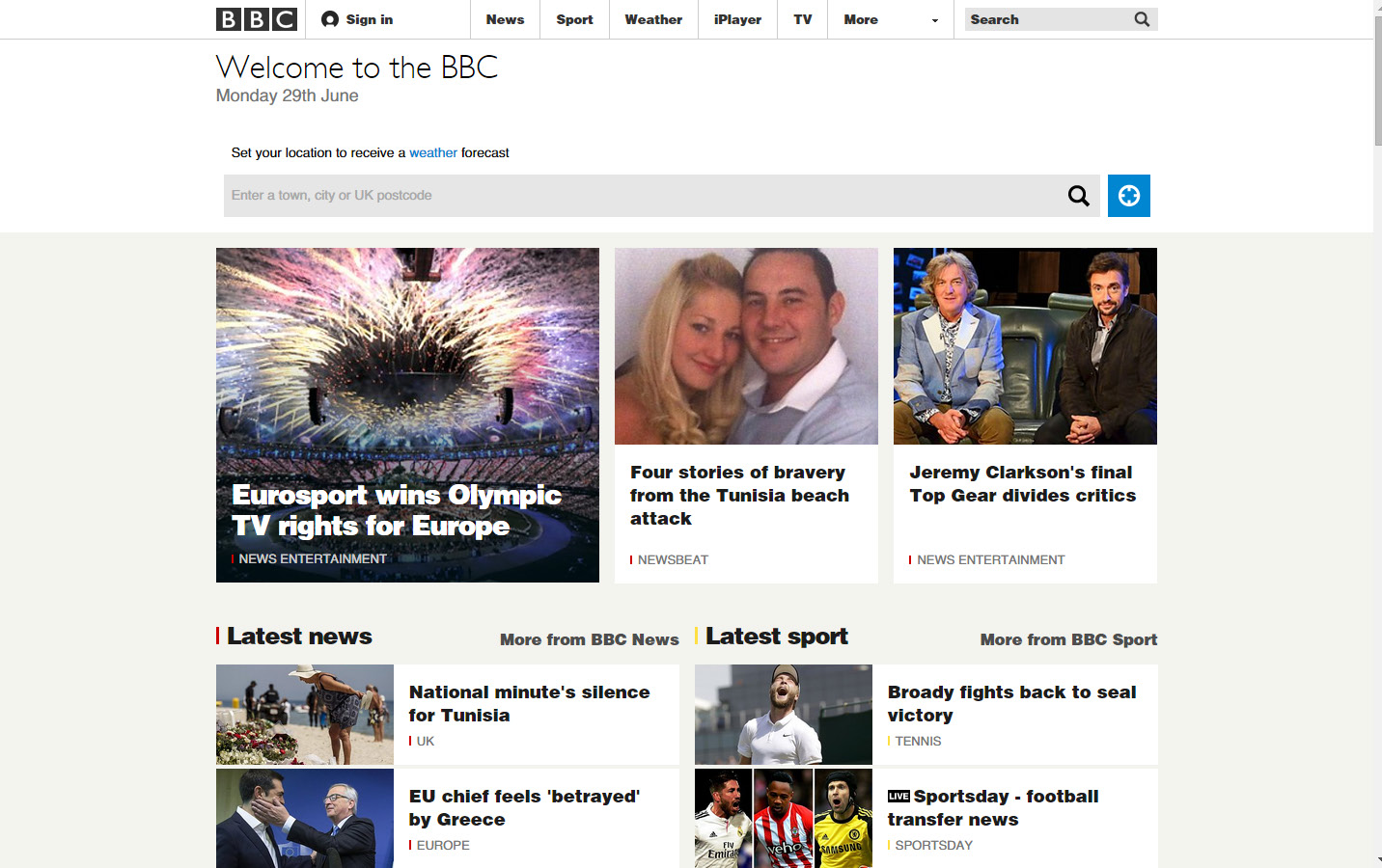
Step 3 – Example 2: BBC
Of late, BBC has been undergoing a string of changes to their site’s design. Whilst not always a great idea, this continuous and evolving site rearrangement has worked well for the corporation. They’re such an established brand that they won’t lose a substantial amount of users from a ‘first-glance’ perspective.
But if you were a small news agency looking to challenge larger organisations in the online news world, what sort of things could you look at regarding the current setup of bbc.co.uk?
To start with, you can see the prominent sign-in at the top, so a membership for your site is a must. It makes them feel part of the brand community and rivals what they’re used to. After that you could look at the main banner – yes, they have a nice ‘local weather’ application there, but because you’re new on the block you may want to go for the impressive entrance with a bold, visual display that hits users first-time.
These are just two obvious examples to roll with. The secret being to contrast the BBC’s site alongside your aim and target audience, and find the missing links.
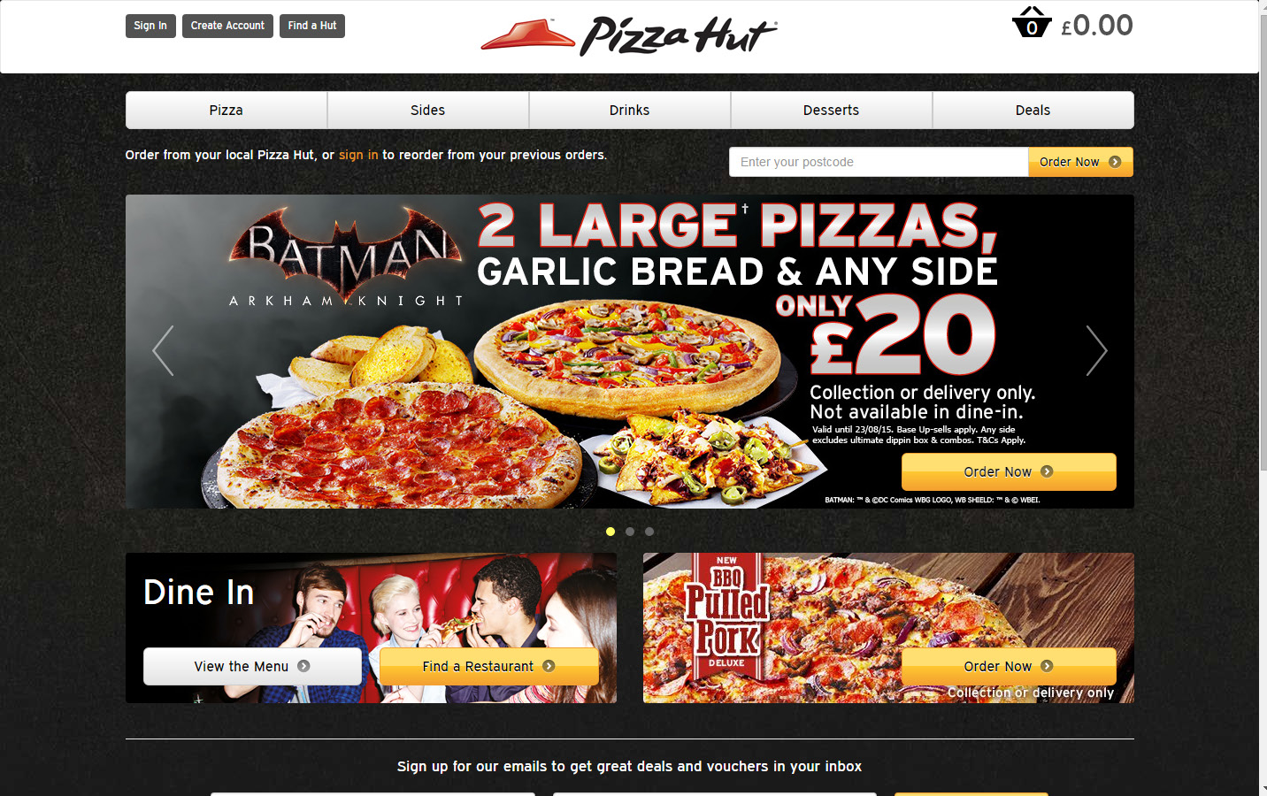
Step 3 – Example 3: Pizza Hut
As a final example for how we could view a competitor, let’s say we’ve just opened a pizza delivery place on the local high street. There are a number of advantages we have from the outset, and we’re going to look to maximise these online.
So you head over to the Pizza Hut website and start looking at things you like and dislike. The most important thing to remember is the difference between your two businesses – because your target audience will most likely be the same on most occasions.
Pizza Hut is a big brand. They have a well-known service with a decent reputation, and people are used to using them for pizza cravings. So you decide to leverage your local and quality feel.
Where they have a ‘Find a Hut’ option, you might like to emphasise that you’re local. Your login link might use a term more familiar, such as ‘Enter Community’ or ‘Come On In’. Where Pizza Hut has angled the grand and bold design, you might lean towards homely colours and images that provide a sense of effort, care and quality.
So it’s not just layout that matters in design comparison – content is critical when looking to outpace your competitors.
Step 4 – Making it mobile
We’ll come clean now – we’ve missed out the whole chunk around compiling research, brainstorming, seeking advice and actually designing your website. But that’s because you already knew all about that, right! Once your site’s designed for desktop, your journey is nowhere near done. Last year we saw mobile overtake desktop as the preferred device for Internet access.
As staggering as that is it doesn’t mean desktop design is obsolete, but it does show how crucial a mobile-responsive site is. Add to that fact Google using responsiveness as part of its ranking signal for mobile searches, and you see the importance.
Now when designing your website for mobile, there are a number of things to consider. What’s the main aim of the site? What is the most important part to achieving that aim? Are your users’ going to be more influenced by the look or information they first see?
If you’re an e-commerce site, you also need to be putting serious thought into whether your desktop version will have the same aim as the mobile site. Conversion rates for mobile are half that of desktop, so there’s a fair chance you’ll want to build user engagement and loyalty more than try to make a sell.
Let’s take a look at sites that have absolutely hit the mark with mobile, and why that is.
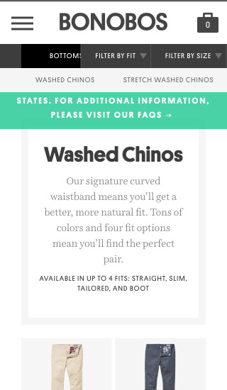
Step 4 – Example 1: Bonobos
Bonobos is a great place for us to start for our responsive site examples. A giant in the clothing business, Bonobo has a relatively loyal consumer base along with an ongoing stream of first-timers.
For this reason, they need to balance window-shopping with information on their mobile version. They do this by providing a quick overview of the company and moving through different options, before letting users start browsing via a side menu.
The browsing pages are laid out just as you would hope an e-commerce clothes site to be: large pictures, easy scrolling, and a minimum of fuss. You can then tap through to an extended viewing area of a specific icon, with a few small UX additions in there like drop-down forms for selecting product types.
The lesson here is to make sure that, whilst tipping your hat to your loyal customers, you are aware that first-time users are bet to find you through their mobile phones!
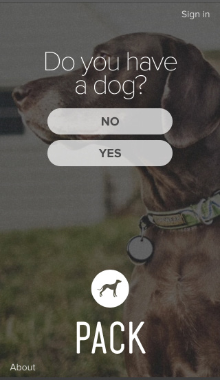
Step 4 – Example 2: Pack
Recently we blogged about some great desktop designs that we loved. In that list was Pack for dog owners (or, indeed, dog lovers).
If you visit their site, we really don’t need to tell you too much about what’s to love. The desktop site folds seamlessly in on itself to become mobile responsive, and it is as simple and as beautiful to use on any device.
This ‘Instagram for dogs’ has perfected the art of user engagement through ease of use, great visuals, and a simple design.
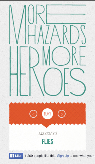
Step 4 – Example 3: More Hazards More Heroes
Whilst there are a number of things about More Hazards More Heroes’ site that we think could be tinkered with for the better, it’s a great site to show you as an example of an important part of responsive design that we spoke about earlier.
More Hazards deliver far more information on their desktop site than on the mobile version. In fact, the mobile version really doesn’t give that much away at all.
What it does do is centre the user’s attention on what the site owners want them to focus on: the product. By taking away potentially messy content, the user is driven to listen to the music as it is the primary part of the site.
The owners know that if the user likes what they hear, they’ll go searching for more information elsewhere. Or pop over to iTunes!
Step 5 – Call to actions
Call To Actions (CTAs) may not be a term you’re familiar with, but by the end of a website design you sure as all things will be! At the end of the day, business websites exist to increase user engagement, conversion, loyalty, or another synonym for modern business.
A Call To Action is precisely that – calling the user to perform a certain act that will benefit your relationship with them. That may be signing up for an e-mail newsletter, donating to your charity, or any other action that contributes to your goal.
The fun thing about designing your CTA is that it’s an open slather – you can open your mind and let those creative juices flow. What is it that you want a user to do? Why do you want them to do it?
Here you combine everything we’ve talked about, everything you’ve learned about your aims, audience and competitors, and put it into something that can have a major effect on the success of your business online.
Whilst perhaps not technically a part of a website’s initial design, it can certainly be argued to fall under that banner because for all intents and purposes, it is a designed feature of your website with the same aim as the website as a whole.
As we’ve done for the other steps, let’s take a walk through the online successes of CTAs.
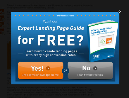
Step 5 – Example 1: Wordstream
The first of our CTA examples comes from WordStream, and is a classic case of “pop ‘em while you’ve got them.” This CTA banner pops up across the screen when your cursor moves to change tabs or exit the screen. There are a number of things that WordStream get right here; let’s start with the wording.
Whilst we hear a lot in today’s marketing (as we should) that audience expectations have changed, and that push-sales aren’t as effective as engagement and pull-marketing, the word ‘free’ can still be surprisingly strong. They’ve used emotional words like Expert and Learn, which add depth to a reader’s desire to make the most of that ‘free’ subject. They have also put studies to good use that show us phrases that are more casual or relational such as ‘Drop some knowledge on me!’, have far higher conversion rates than just writing ‘yes’ or ‘okay’.
Importantly, they’ve utilised colours as the final driver. Out of orange and grey, your eyes are far more likely to cross over to the ‘Yes!’ button. This is a critical lesson that is a feature of most effective CTAs, and one that you need to be making the most of as you enter this stage of your website design.
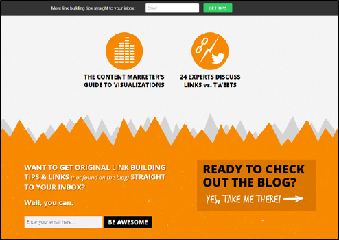
Step 5 – Example 2: Point Blank SEO
We love this example. Point Blank SEO have pinned an initial, highlighted CTA to the top of the screen, but when the user has scrolled to the bottom they’re hit with a themed, casual “go get ‘em” that targets what the user (as seen by their reach of the bottom of the page) is here for. What’s interesting about this CTA is that the lesson around a stand out colour (like Point Blank uses with the pinned one at top) is not really abided by, and yet the black provides enough of a contrast that your focus is directed to the content. They also give users a couple of different options – a simple subscription or a direct viewing of the blog. This way, more than one audience can be approached.
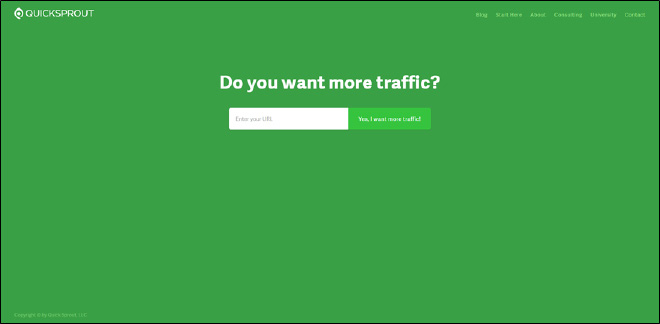
Step 5 – Example 3: Quicksprout
As a final look at real-world CTAs we head over to Quicksprout who, unlike WordStream and Point Blank SEO, make use of a full-screen, opening landing page that drives home exactly what the service is and makes it clear for the user whether they’re the intended audience or not. Whilst a fairly blunt, simple CTA, this is one of the most effective examples we’ve seen because it combines a sense of ease and honesty with a case of ‘what else can I do?’ When designing a CTA, make sure you balance a polite, unobtrusive approach to the people you’re hoping to build a relationship with, with a direct and effective campaign.
Summary
What to take away
If you’re still with us – well done! It’s been a bit of a journey but hopefully you’ve had some ideas spring up from everything you’ve read. At the end of the day, that’s what web design is: ideas that come about because of what’s around us, what we see, and things that others make us think about.
The 5 steps we’ve gone through – Clarify, Understand, Research, Mobile and CTA – are not steadfast rules. Rather, they’re meant as an inspiration for you at the start of what should be a fun but thorough process.
Clarifying your business’s online aim is crucial to achieving your end goal, as without it, you’ll struggle to understand who exactly your audience is. Accordingly, without researching your competitor sites, you might find it hard to cut through the noise and reach those you hope to build a relationship with.
To round it off, both responsive websites and those making use of CTAs are necessary in a world where mobile sites, low bounce rates, high conversions and a myriad of other statistics influence how well you rank on Google.
Don’t let this article daunt you – let it help you on your way to online success!
How to get in touch
WOLF
Delta House
16 Bridge Road
Haywards Heath
West Sussex
RH16 1UA
Phone: 01444 616 616
Email: [email protected]
Sources
– netmagazine.com/tutorials/make-your-sites-load-faster
– nngroup.com/reports/how-people-read-web-eyetracking-evidence/
– socialmouths.com/blog/2013/03/06/how-to-build-instant-trust-on-your-website/
– sdl.com/ilp/cxc/five-future-truths/millennial-mindset-infographic.html
– adweek.com/news/advertising-branding/gen-z-infographic-can-help-marketers-get-wise-future-159642
– smartinsights.com/mobile-marketing/mobile-marketing-analytics/mobile-marketing-statistics/