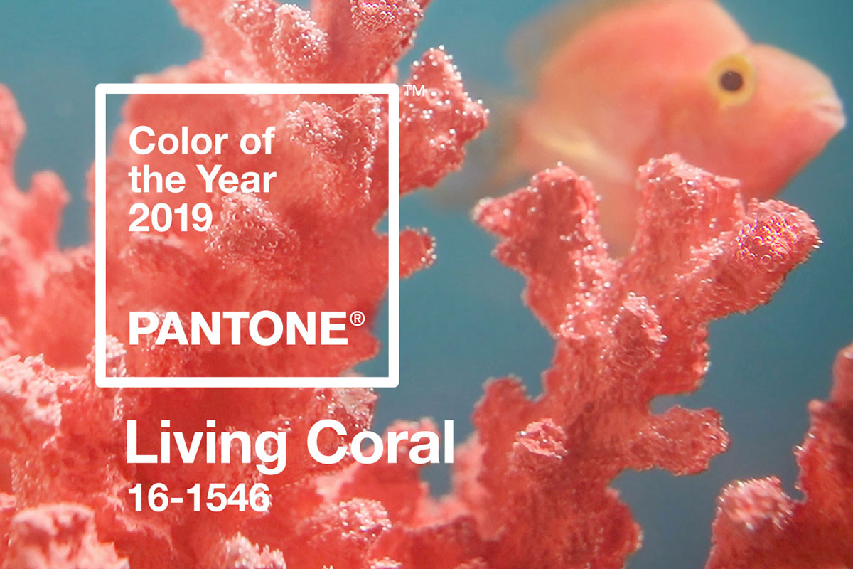
Pantone has announced their Colour of the Year 2019: Living Coral. The Pantone code is 16-1546, and here we look at why Pantone thinks it’s the colour to watch in the coming 12 months.
Who is Pantone?
For the uninitiated amongst us, the Pantone Color Institute “provides color trend forecasting, color insights and customized color consulting.” They play a big role in how brands see design trends, and understand what colours will emotionally engage or connect consumers, meaning the Pantone Colour of the Year moment is a bigger thing that many outside the industry would expect.
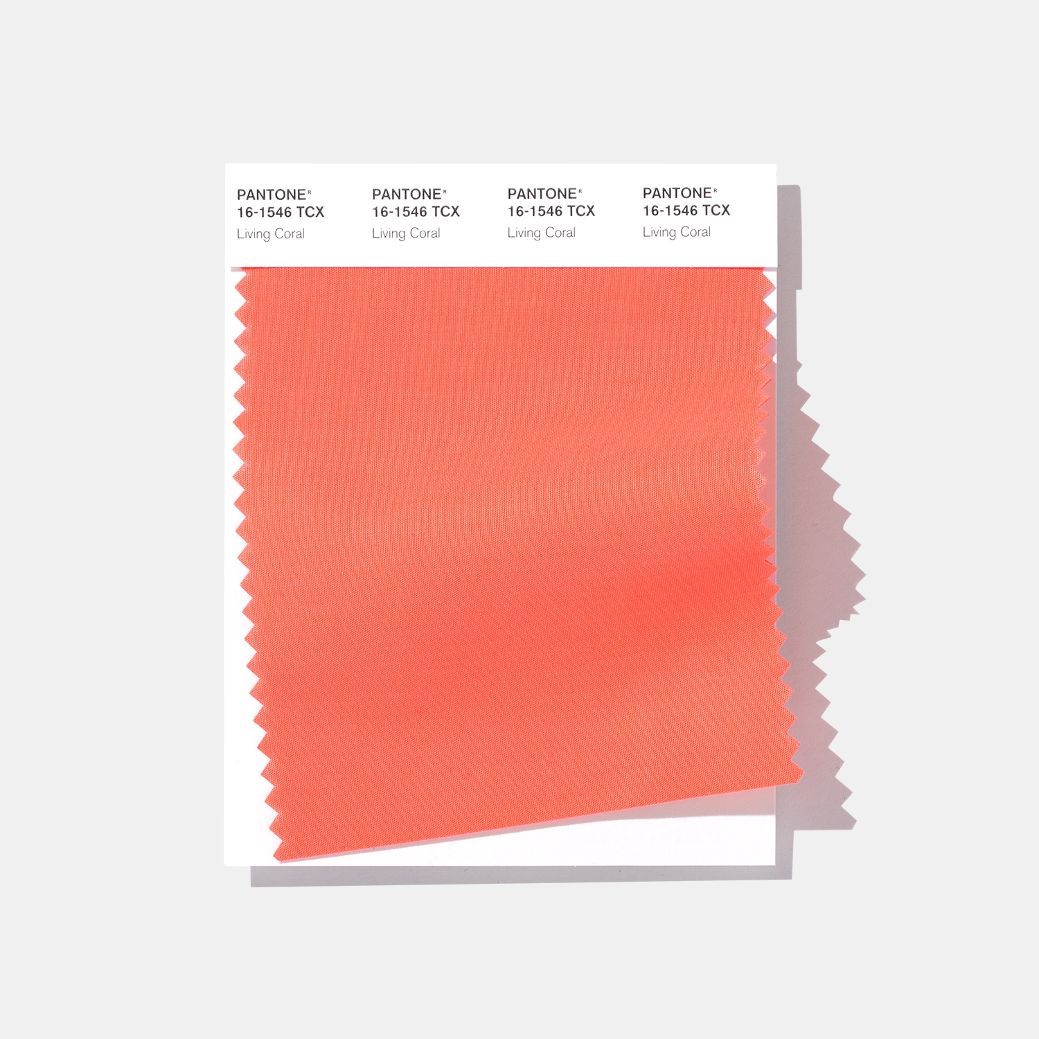
Why 16-1546 Living Coral
“An animating and life-affirming coral hue with a golden undertone that energizes and enlivens with a softer edge”
is how Pantone themselves describe Living Coral. In the full release, the company talks of the need people are feeling to connect on a more authentic fashion, considering the bombardment of technology, and the screen fatigue many of us feel.
They say:
“In reaction to the onslaught of digital technology and social media increasingly embedding into daily life, we are seeking authentic and immersive experiences that enable connection and intimacy. Sociable and spirited, the engaging nature of PANTONE 16-1546 Living Coral welcomes and encourages lighthearted activity. Symbolizing our innate need for optimism and joyful pursuits, PANTONE 16-1546 Living Coral embodies our desire for playful expression.”
Why is Colour so important for brands?
Pantone says that in the current age of marketing and a flooded consumer base, brands “leverage color’s poignant power to differentiate and connect” with their audience. As with all things marketing, how much one reads into this as important depends on who you speak to, and the nature of their marketing.
Obviously, the teams working with data may not take too much notice of this beyond how different palettes affect user interactions, but the design department will certainly be going over this new guidebook with a fine tooth comb, as it can reveal certain emotional drivers amongst recipients.