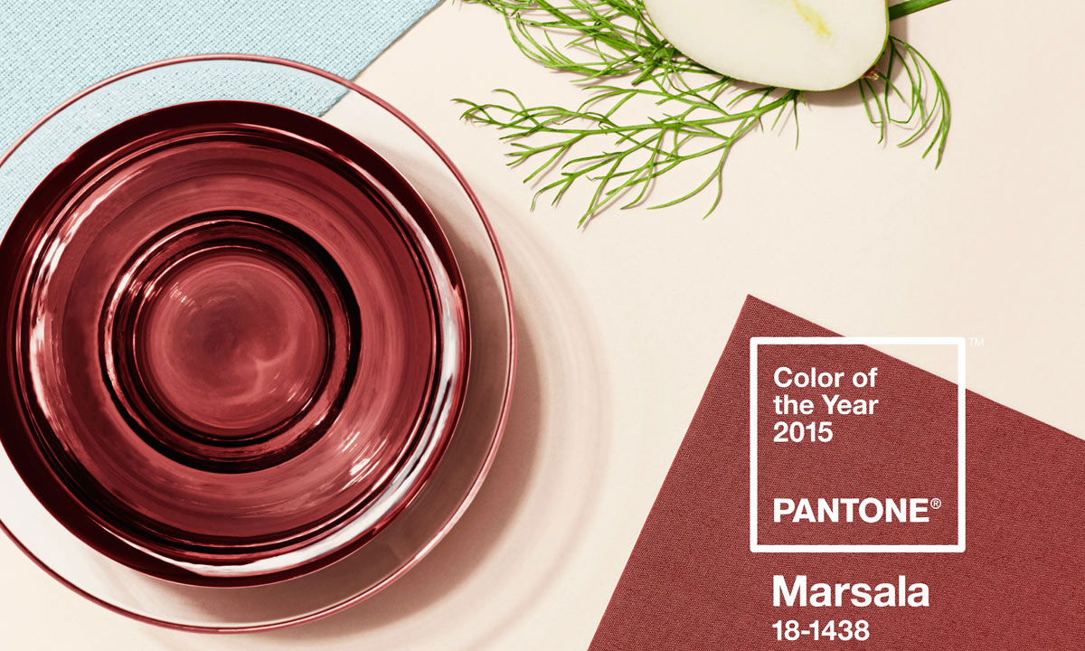
Pantone has announced its colour of the year for 2015. The colour is Marsala or, in the Pantone colour matching system, Marsala 18-1438.
Marsala 18-1438 is a rich earthy red or purple which brings to mind terra-cotta, or perhaps a cocktail of strawberries and blackberries. Leatrice Eiseman, the executive director of the Pantone Colour Institute claimed that the colour was selected as it;
“enriches our mind, body and soul, exuding confidence and stability”
The name Marsala comes from Marsala wine produced in the Marsala region in Sicily. The Marsala wine that reaches our shelves is fortified and has similar alcohol content to sherry or port. Drunk as an aperitif, it is also a popular marinade; roast beef Marsala doesn’t only taste wonderful, it retains that special rich warming colour.
So where will we see Marsala?
Fashion
The colour has already been adopted by the fashion world. Designers such as Calvin Klein and Louis Vuitton are using it; Khloe Kardashian wore it at Elton John’s Oscar party; Blake Lively wore it at Cannes; and it isn’t only the women, the English Actor David Oyelowo appeared on the red carpet at the 2015 Oscars wearing an exquisite Dolce & Gabbana tailored Marsala three piece suit.
Interior Design
Marsala is proving to be a great choice for interior design and is a popular choice for comfortable cosy bedrooms and in exciting colour combinations for decorating any living space. When we get it right it can recreate the natural beauty of sunsets, bouquets of red roses, and sweet summer berries.
Graphic design
Marsala is also a hit in graphic design. Pantone say that it is “eye catching but not overwhelming” and that consumers are drawn to the colour; perfect for point of purchase. It works well on different materials, and is great for periodicals and printed items such as stationary and all forms of promotional material.
Marsala – the new black
The colour is said to appeal as much to men as it does to women. Purples in general are evocative of strength, power and sophistication, and Marsala takes this to a higher level. It is also versatile. When produced in matte it emphasises its earthy natural nature, though when sheen is added it evokes luxury and glamour.
Pantone suggests pairing Marsala with other purples and light pink hues, greens and greys, and blues such as aqua and teal. There is no doubt; for 2015 Marsala is the new black.
Choosing the colour of the year
How does Pantone choose the colour of the year? Do they simply brainstorm it in a meeting, pick it out of a hat, or use some other more sophisticated method?
In fact there is a group of colour experts around the world whose identities are kept a closely guarded secret. Their role is to monitor colour trends and each year they meet for two days during which time they produce a palette of trending colours which are published in Pantone View. It is from this palette that the colour of the year emerges.
Using Marsala 18-1438 for your business
If your business is as fleeting as fashion, there are few challenges in embracing Marsala as this year’s trending colour; just treat is as the new black. However if your business already has its own brand with its carefully selected corporate colours, you can hardly be expected to ditch them and substitute this year’s colour fashion trend.
It is important to incorporate Marsala in ways that will enhance the way your business is viewed and won’t damage your long term brand. There are many means of achieving this and every case is different, but they all require creative inspiration matched with careful graphics design.