Working in design, we’re obviously passionate about the trends of the industry and, indeed, throughout society as a whole. That’s why something we look forward to each year is Pantone’s announcement of their Colour of the Year.
Whilst this may not seem like such a big deal, it’s actually a telling moment in this industry, where the psyche of the wider public plays such an important role in the work we do and how effective our designs are. This of course needs to be metered with staying true to a brand’s own colour scheme and identity, but there’s nothing to say that both brand identity and social trends can’t harmonise to deliver stunning, effective campaigns.
So without further adieu, what is ‘Pantone Colour of the Year’ and what is the 2016 winner?
What is Pantone Colour of the Year?
Pantone is both a proprietary colour-matching system and a company – the former being perhaps what it’s better known for, with the latter being named after the fact. Each year the company announces what a group of colour experts (the judges) have decided is the colour that best represents the year’s trend. This comes after a palette of trending colours is published in Pantone View.
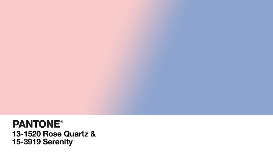
What is the 2016 Colour of the Year?
For the first time, Pantone has announced two colours as the duel winner; not in spite of each other but rather as a familiar duet. Serenity and Rose Quartz are the 2016 victors, and the associated theme is said to be ‘harmony, calm and balance.’ Certainly this comes through when one considers the tones are familiar to both sexes from childhood.
Pantone Colour Institute Executive Director Leatrice Eiseman says, when asked about the result, “In many parts of the world we are experiencing a gender blur as it relates to fashion, which has in turn impacted colour trends throughout all other areas of design.”
Going further on their site, Pantone comments that Serenity and Rose Quartz are ‘a harmonious pairing of inviting shades that embody a mind-set of tranquillity and inner peace.’
So, certainly the overriding feeling is one of calm acceptance with a touch of Zen, but how can we apply this to graphic design in what is very much a dog-eat-dog world? Turns out, the good folk at Pantone have let us in on that answer too.
“As consumers seek mindfulness and well-being as an antidote to modern day stresses, welcoming colours that psychologically fulfil our yearning for reassurance and security are becoming more prominent. Joined together, Rose Quartz and Serenity demonstrate an inherent balance between a warmer embracing rose tone and the cooler tranquil blue, reflecting connection and wellness as well as a soothing sense of order and peace.”
Eiseman adds
“The consumers’ increased comfort with using colour as a form of expression includes a generation that has less concern about being typecast or judged, and an open exchange of digital information. This has opened our eyes to different approaches to colour usage.”
These colours may not be part of your brand, but Pantone has a good history of pointing designers in the right direction. Because of this, you may be well advised to sneak a bit of these comfort-enhancers into your adverts at some point in the next 12 months.