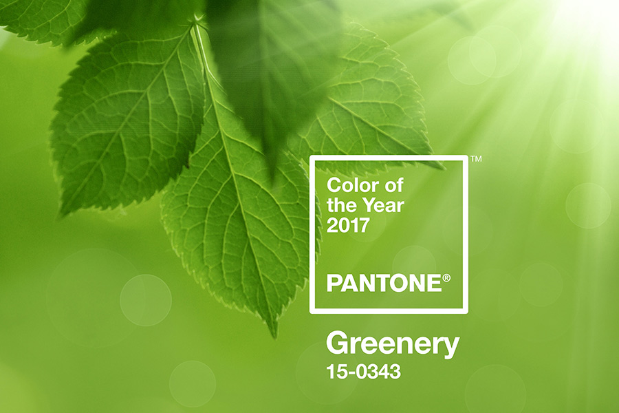
As they do every year, Pantone has released the colour they think will dictate design and aesthetics for the coming 12 months. This year, the base tone is Greenery, and we’re taking a look at why they think this will set the trends in 2017.
What is the Pantone Colour of the Year for 2017?
Pantone has announced that Greenery (PANTONE 15-0343) is to lead the way next year. As they put it: ‘A refreshing and revitalising shade, Greenery is symbolic of new beginnings’, which reflects the social and political aspect to their decision.
The company says that with the upheaval that has taken place around the world – think Brexit and a divisive US Election – this shade of colour helps bring humanity to a focal point of regeneration.
According to the Executive Director of the Pantone Color Institute, Leatrice Eiseman, “While Serenity and Rose Quartz, the PANTONE Color of the Year 2016 expressed the need for harmony in a chaotic world, Greenery bursts forth in 2017 to provide us with the hope we collectively yearn for amid a complex social and political landscape.”
She adds that, “Satisfying our growing desire to rejuvenate, revitalise and unite, Greenery symbolises the reconnection we seek with nature, one another and a larger purpose.”
What does Greenery represent?
As well as the political and social impacts of 2016 and how that impacts this colour choice, Pantone were quick to point out the other key factors associated with this shade.
In their statement, they talk about ‘green’ as a “colour of innovation” and a reflection of our drive to pursue our passions. They say it complements the booming tech and digital industries with its “boldness, vigor and modernity” and suits the fashion world through being “nature’s neutral.” But it doesn’t stop there.
Over on the Pantone website you can see the full list of how Greenery arguably fits into a variety of industries, from food and beverage to architecture.
How should you be led by this announcement?
Of course, Pantone’s Colour of the Year does not necessarily drive all design you’ll come across, with their 2018 choice invariably led by those decisions that break the mold next year. However, it can be a safe bet if looking for a theme.
From our end, it looks a pretty decent choice. Last year’s colour (Serenity and Rose Quartz) was perhaps a bit light and faded for the year that it turned out be, but Greenery does seem to be a better option, with a definite tendency of many in the public seeking a new connection with the outdoor world.
Yes, there has been political and social upheaval, but it’s down to you and your client list as to whether this should effect what you put out into the public sphere with your brand behind it.
Still, from a purist’s perspective, society certainly trends specific colour themes, and as such taking note of Pantone’s announcement is worth your while when it comes to choosing how to move forward with new products and designs.
What do you think of Pantone’s colour choice? Let us know by sharing this article and commenting in the post!


